
The one variable you actually control

You cannot control the weather on shoot day. You cannot control whether the light goes soft at 6pm or stays flat and grey. You cannot control how your kid feels about standing still.
You can control what everyone wears. It is the single largest variable in the entire session that sits entirely in your hands, and most people decide it the night before by pulling something out of the closet that looked good at dinner last week.
That instinct is understandable and it is usually wrong, because a camera is not a mirror. A mirror shows you a moving, three-dimensional person under whatever light happens to be in the room. A photograph flattens you into two dimensions, freezes one four-hundredth of a second, and records color through a sensor with hard limits on how much brightness range it can hold. Clothing that reads as sharp in a mirror can read as a smear of grey, a blown-out white shape, or a shimmering optical illusion in the final frame.
The stakes are higher than most people assume. Princeton researchers Janine Willis and Alexander Todorov found that judgments made after a 100-millisecond exposure to a face correlated highly with judgments made with no time limit at all, across traits including trustworthiness, competence and likeability. More looking time did not change the verdict. It only made people more confident in it. Whatever your photo says about you, it says in a tenth of a second, and your clothes are a large part of what it says.
This guide walks through the decisions in the order a photographer would make them: location first, then palette, then fabric and fit, then the details that quietly ruin frames. It also covers the parts most outfit guides skip, including what a sensor physically does to certain fabrics, what AI editing can and cannot repair afterwards, and how companies handle wardrobe when the shoot involves two hundred people instead of four.
What your clothes are doing to the viewer
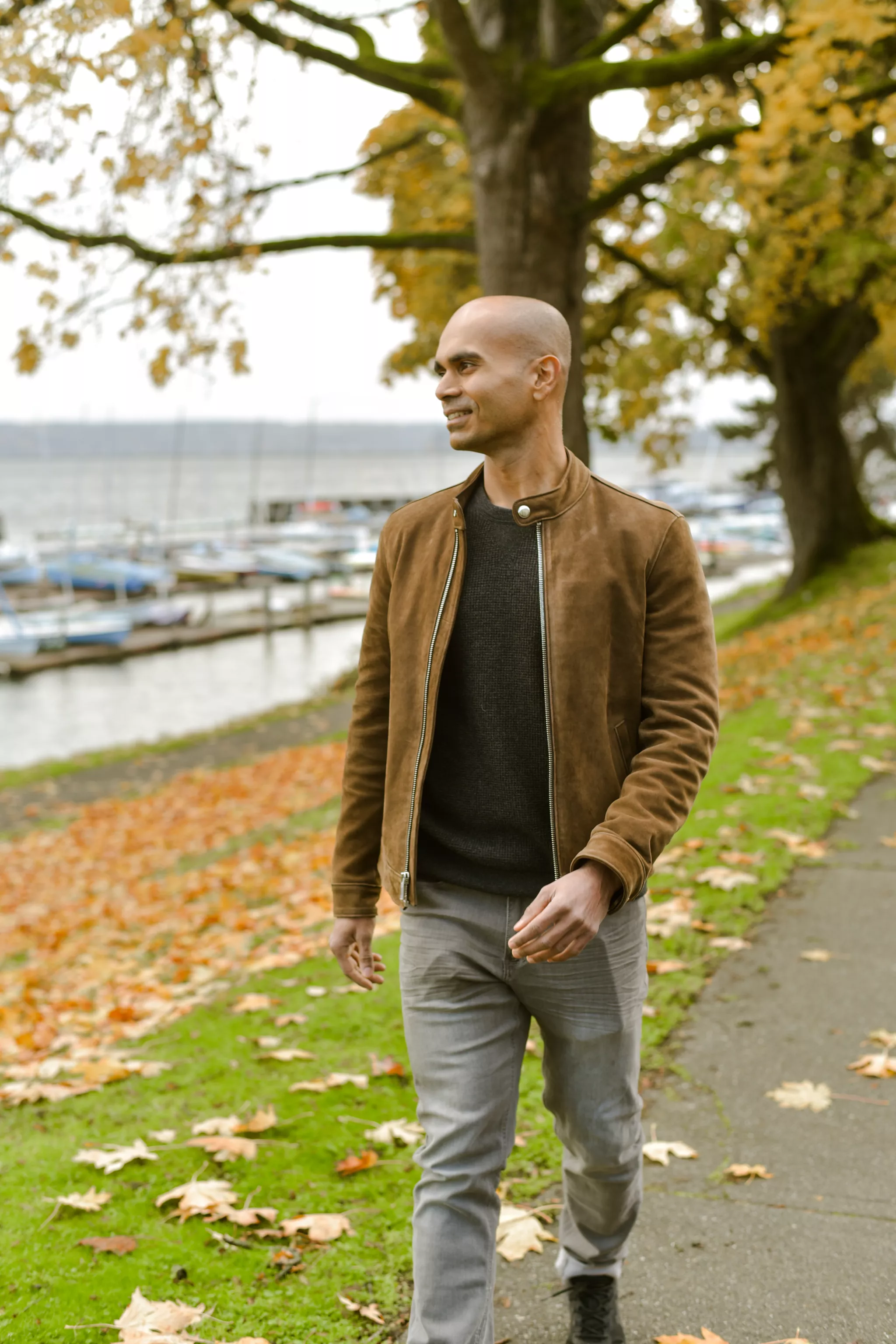
Outfit advice usually stops at flattering. The measurable effects run further than that.
Photofeeler ran a study on 800 profile photos rated more than 60,000 times for perceived competence, likability and influence. Of every variable tested, nothing moved competence and influence more than how formally the subject was dressed. Formal dress produced an average increase of +0.94 in competence and +1.29 in influence, the biggest single effect in the study for those two traits. The same research found a smile with visible teeth lifted likability by +1.35, and that sunglasses cost the wearer an average of -0.36 in likability.
Those numbers matter because photographs are doing real work now. LinkedIn's own data shows members with a photo receive 21 times more profile views and 9 times more connection requests than members without one. And people genuinely look. In a Nielsen Norman Group eyetracking study of a company team page, a test user spent 10% more time viewing the portrait photos than reading the biographies, even though the written bios occupied 316% more space on the page.
The same research adds a caveat worth carrying into any shoot. NN/g found users scrutinize photos of real people and ignore stock photos of generic models. The distinction viewers are making is authenticity, and clothing is one of the fastest signals of it. An outfit that looks borrowed, stiff, or bought for the occasion reads as staged. An outfit that looks like yours reads as real.
Start with the location, not the closet
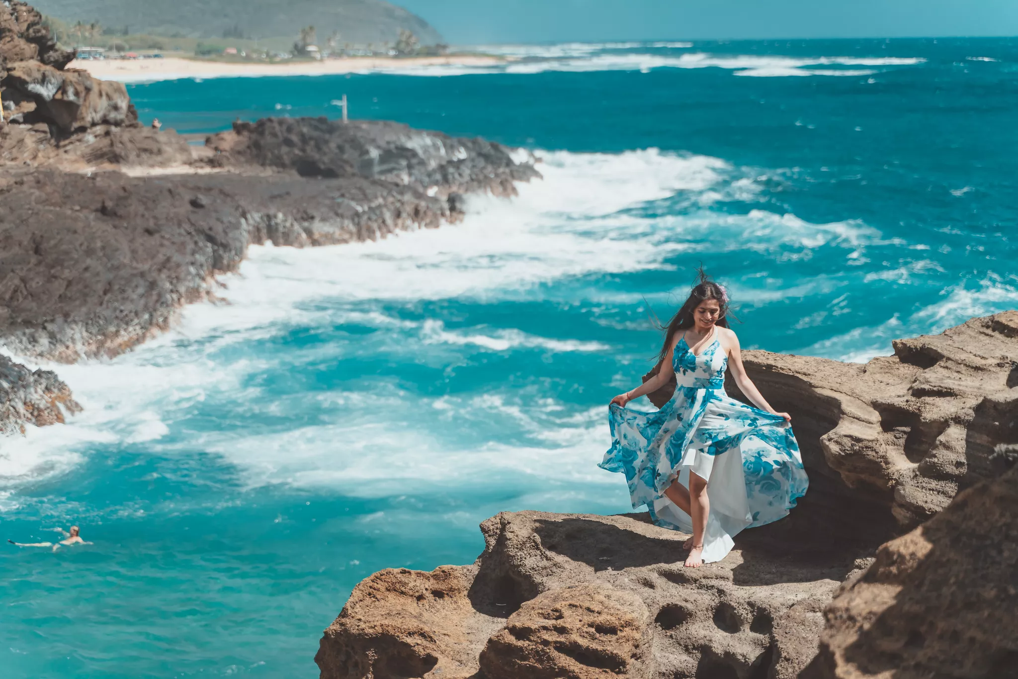
Every photographer will tell you the same thing, and almost every client does it backwards. Pick the outfit last.
A location has a palette whether you planned one or not. A pine forest is deep green and brown. A beach is sand, pale blue and bleached grass. A downtown alley is grey concrete, brick red and dark glass. A white-walled studio is a blank slate. Your clothes are going into that palette and they will either sit inside it or fight it.
Two approaches work, and they produce different photographs.
Harmonize by choosing colors that already exist in the location. Rust, cream and olive in an autumn field. Denim, white and soft grey on a coastline. The result is a photograph where the subject and setting feel like one image rather than a person pasted onto a backdrop. This is the safer choice and the one that ages best.
Contrast by choosing colors opposite your location on the color wheel. A rust dress against green summer grass. A mustard coat against a slate winter sky. This produces a photograph where the subject leaps forward. It is a stronger visual statement and it is less forgiving, because a contrast that misses reads as a clash.
One practical rule that resolves most of it: if the location is busy, keep the clothing quiet. If the location is plain, the clothing can carry the interest. A wildflower meadow and a floral dress compete. A concrete wall and a floral dress do not.
Season matters here too. The same park is olive and gold in October and grey and bare in February. Ask your photographer what the location will actually look like on your date, not what it looked like in the portfolio image shot in a different month.
Build a palette, do not match outfits

The single most common group photo mistake is identical outfits. Everyone in white shirts and jeans. Everyone in the same red sweater. It reads as a uniform, it flattens the group into one shape, and it dates the photograph instantly.
Coordinate instead. Pick two or three base colors plus one neutral, then let each person wear a different combination of them. A palette of navy, cream and rust across five people produces five distinct outfits that clearly belong together. Nobody disappears and nobody clashes.
A few things that make coordinating easier:
Choose colors from the room where the photo will hang. If your living room is warm neutrals, a family portrait shot in cool blues will always feel slightly off on that wall. This is one of the most useful and least-mentioned tests available.
Vary the tone, not just the color. Five people all in mid-tone blue is still a uniform. Light cream, mid denim and deep navy is a palette with depth.
Assign the hardest person first. There is always one person in the group with the least flexible wardrobe or the strongest opinion. Build the palette around what they will actually wear, then dress everyone else to fit. Working the other way around produces four settled outfits and one argument.
Consider undertone. Warm undertones tend to sit well in cream, camel, olive and rust. Cool undertones tend to sit well in white, grey, navy and true blue. This is not a rule so much as a starting point, and the fastest test is to hold two shirts under a window and see which one makes your face look brighter rather than washed out.
What a camera sensor does to your clothes
This is the part almost no outfit guide explains, and it is the reason several of the standard rules exist.
Fine patterns can break the sensor
You have been told to avoid thin stripes, small checks and tight herringbone. The reason is a physical effect called moiré. A digital sensor samples an image at a fixed grid of photosites. When the fabric in front of it contains repetitive detail that exceeds the sensor's resolution, the two grids interfere with each other and produce wavy bands and false color that were never in the room. It looks like an oil slick crawling across a shirt.
Moiré cannot be reliably fixed in editing. It is not a color mistake, it is missing information. Once the sensor has aliased the pattern, the original weave is not recoverable. This is why photographers ask about pinstripes before the shoot rather than after.
The safe threshold: if a pattern is smaller than a coin, leave it home. Larger patterns are fine, and often better than a plain block of color.
Pure white and pure black have no detail to give
A sensor holds a finite range between the brightest and darkest tones it can record. Anything brighter than the top of that range records as pure white with no texture. Anything darker than the bottom records as pure black with no texture.
A crisp white shirt in direct sun frequently exceeds the top. A black suit in shade frequently falls below the bottom. In both cases the garment stops being fabric and becomes a flat shape. Worse, if one person wears white and another wears black in the same frame, the photographer has to choose which one to expose for, and somebody loses.
Off-white, cream, oatmeal, charcoal and deep navy give you the same visual read with detail intact. This is why photographers keep steering people toward mid-tones. It is not aesthetic conservatism, it is the sensor's dynamic range.
Sheen behaves differently than you expect
Satin, sequins, patent leather and heavily synthetic fabrics reflect light rather than absorbing it. Under a flash or in direct sun they produce hot spots that read as bright blobs. Matte fabrics with visible texture do the opposite: linen, wool, cotton, suede and chunky knits catch light gradually and give a photograph depth.
Texture is the most underrated wardrobe asset there is. A cream cable-knit sweater and a cream polyester blouse are the same color and completely different photographs.
Wrinkles are louder in a photo than in a room
A high-resolution sensor with directional light will find every crease. Steam everything, including what is underneath the jacket you plan to keep on, because you will take the jacket off at some point.
Fit beats brand, price and trend
If you take one thing from this guide, take this: nothing photographs worse than clothing that does not fit, and nothing photographs better than clothing that does.
A camera reads silhouette before it reads anything else. Loose clothing adds volume that is not there. Tight clothing creates pull lines across the chest, hips and shoulders that a lens renders as harsh diagonal shadows. A well-fitted mid-price shirt beats a poorly-fitted designer one every time, and it is not close.
Comfort is the other half of the same point. Being photographed makes most people self-conscious, and clothing you are managing makes it worse. If you spend the session adjusting a neckline, tugging a hem, or worrying about a shoe, that shows in your face in every frame. The photographer cannot edit tension out of an expression.
Two practical tests. Sit down in the outfit, stand up, walk a short distance and raise your arms. If anything rides up, gapes, or needs a correction, it will do that for two hours on shoot day. Then take a phone photo of yourself in it in daylight. The phone will show you the silhouette a camera sees, which is not the one the mirror shows you.
Timeless also beats trendy, for a boring but decisive reason. You are going to look at this photograph for a decade or more. Sharply fashionable pieces date the image to a specific year in a way that classic shapes and colors do not. Save the statement for one element and keep the rest quiet.
The details that quietly ruin frames
Most photos are not ruined by the main garment. They are ruined by something small that nobody thought about.
Logos and graphics pull the eye straight to a brand name and date the photo the moment that logo changes. Keep clothing clean of visible branding.
Shoes are in more of the frame than people expect, especially in full-length and seated poses. Scuffed sneakers under a beautiful outfit is one of the most common regrets in family shoots. Bring the shoes you want photographed.
Undergarments show. Visible bra straps under a thin top, a dark bra under white cotton, or seam lines through fitted fabric all show up more clearly on a sensor than in a mirror. Check in daylight, not bathroom light.
Accessories should be intentional and few. One good piece adds character. A watch, a necklace and stacked bracelets and earrings compete with the face. If a photograph is about a person, the accessories are supporting cast.
Hair ties on wrists show in every single arm-down shot. Take them off or hide them.
Glasses reflect. If you wear them daily, wear them in the photo, because a photo without them will not look like you. Tell the photographer in advance so they can angle the light to control glare.
Skin exposure sets the tone. Sleeveless is fine and often lovely, but strapless tops in a tightly cropped headshot can read as though the subject is wearing nothing at all. Check the crop your photographer plans to use.
Outfits by shoot type
The principles above hold everywhere. The application changes.
Headshots and personal branding
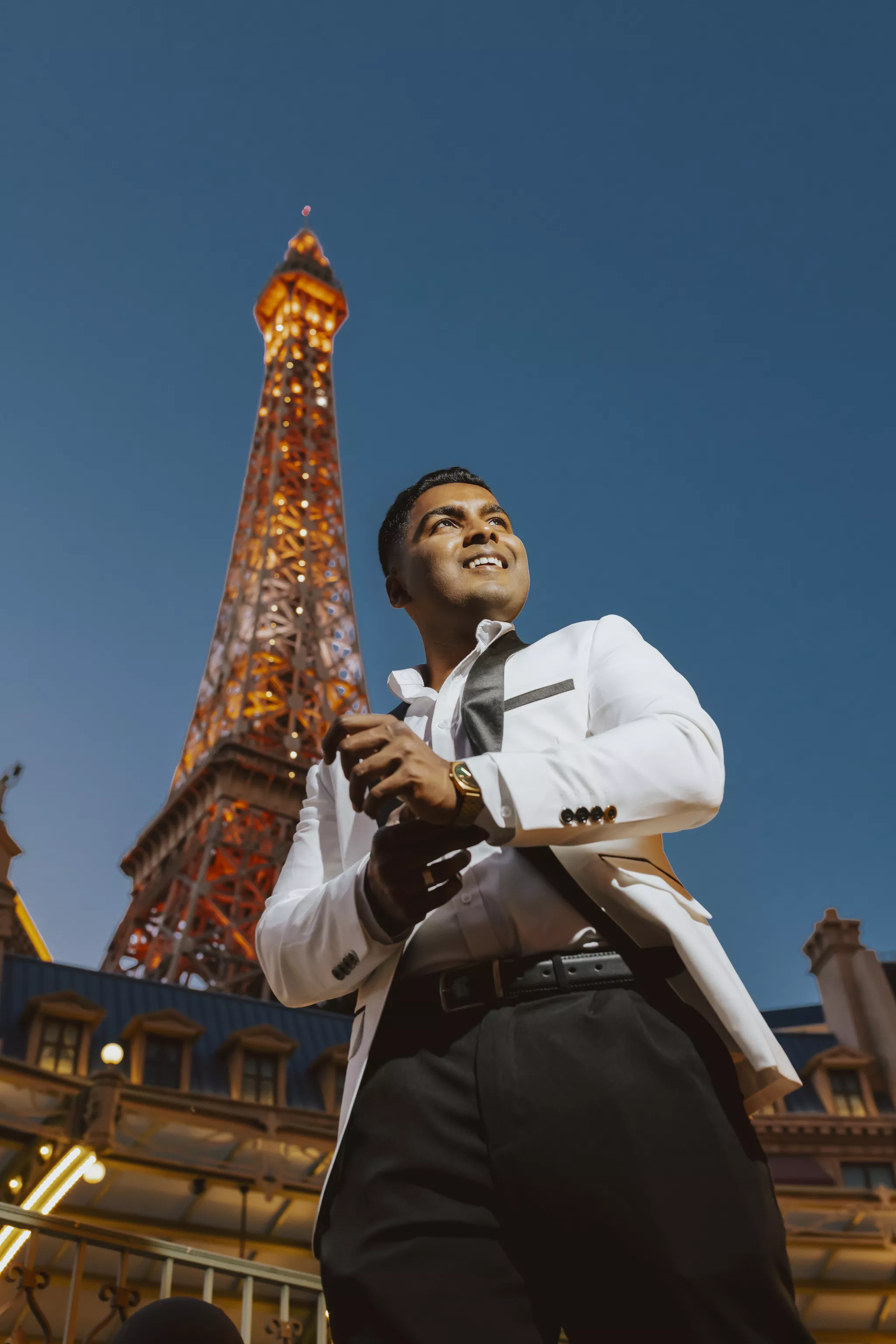
Formal wins here, and the data backs it. Photofeeler's finding that formal dress produced the largest gains in competence and influence applies most directly to professional portraits. Solid mid-tone colors, a structured shoulder, and a neckline that frames the face rather than competing with it.
Color choice carries signal too. In CareerBuilder's national survey of 2,099 hiring managers and HR professionals, blue was the most-recommended interview color at 23% and black second at 15%, while orange topped the worst-color list at 25% and was the color most associated with being unprofessional. That survey is from 2013 and the underlying instinct has not moved much: blue reads as a team player, black reads as authority, and highly saturated warm colors read as informal.
If the shot is going on LinkedIn, our guide to choosing the right LinkedIn profile picture covers the framing and expression side, and why your headshot is a core piece of personal branding covers what the image needs to communicate before you pick the shirt. If you want a second opinion on a shot you already have, Snappr's free Photo Analyzer scores it. For a look at how much variance exists even at the top, our breakdown of the Fortune 500 CEOs with the best and worst headshots is instructive. Once the outfit is settled, our headshot posing guide covers the other half of the shot, and corporate headshots walks through what a team-wide session involves.
Family photos
Coordinate, do not match. Build the palette around the least flexible wardrobe in the group. Dress children in clothes they can move in, because a child managing an uncomfortable collar is a child who is not smiling. Bring a spare outfit for anyone under six.
Layers do double duty in family sessions. They handle temperature swings across a two-hour session and they give you a second look without a full change. Our guide to family photography sessions covers what else to plan for once the wardrobe is sorted.
Engagement and couples
Complement rather than match. One person in a pattern and one in a solid from the same palette works reliably. Coordinate formality levels above all: a cocktail dress next to a t-shirt reads as a mistake regardless of how good both pieces are.
Movement matters more here than in any other shoot type, because couples photography involves walking, spinning and holding each other. Fabrics with drape, such as flowing skirts, long dresses and loose linen, photograph beautifully in motion. Stiff fabrics do not move at all. Pair the outfit choice with our engagement photo posing guide, since drape only reads well in poses that let it move.
Maternity
Fitted through the bump rather than draped over it, because loose fabric reads as volume rather than shape. Solid colors, and long lines. Bring one option that bares the bump and one that does not, then decide on the day based on how you feel. Our maternity posing guide shows which shapes those outfits need to work with.
Senior portraits
This is the one shoot type where personality should beat convention. Bring three outfits across a range: one polished, one everyday, one that is unmistakably the subject's own style. The keeper is usually the third one. Match each look to a different setup using our senior photo posing guide.
Weather, season and the case for layers
Layers are the most useful thing you can pack, for three reasons.
They give you multiple looks without a full outfit change, which matters because changing clothes eats session time you are paying for. A jacket on and off is two distinct photographs in about four seconds.
They handle temperature. Golden hour in October is warm at the start and cold at the end. A person who is genuinely freezing looks like a person who is freezing, and no amount of direction fixes it.
They add visual depth. A shirt under a cardigan under an open coat gives the camera three planes to work with instead of one flat surface.
Weather-specific notes worth planning for. In heat, choose breathable natural fibers and avoid anything that shows sweat, which rules out light grey and most polyester. In rain, dark colors, textured fabrics and a good coat produce genuinely striking photographs, so do not cancel automatically. In wind, be careful with very light fabrics and long unstyled hair, since both will spend the session across your face.
The pre-shoot outfit checklist
Most outfit guides hand you an unordered pile of tips. Here is the sequence, in the order that resolves the most decisions the fastest.
1. Confirm the location and the time of day with your photographer, and ask what the setting will look like this month.
2. Pick two base colors plus one neutral, drawn from or deliberately contrasted with that location.
3. Choose the least flexible person's outfit first and build the rest of the group around it.
4. Check every garment against the sensor rules: nothing smaller than a coin in pattern, no pure white or pure black, no high-sheen fabric, no visible logos.
5. Run the fit test. Sit, stand, walk, raise your arms, then take a daylight phone photo.
6. Add one statement piece, and only one, across the entire group.
7. Add layers for every person.
8. Sort the small things: shoes, undergarments, accessories, hair ties, steaming.
9. Lay all outfits out together the night before and photograph them side by side in daylight.
10. Pack one backup per person, and two for anyone under six.
The night-before flat-lay is the step people skip and the one that catches the most problems. Clashes that are invisible in separate closets are obvious on a bed.
What AI editing can and cannot fix afterwards
Modern editing is genuinely good, and it has quietly changed which outfit mistakes are recoverable. It is worth knowing which side of the line your problem falls on.
Editing handles these well. Color grading can shift a palette that came out slightly off toward warmer or cooler. Minor wrinkles and stray lint can be retouched. Small distractions such as a hair tie or a tag can be removed. Overall exposure can be nudged. Our overview of what AI photo editing can do and when to use it covers the current capabilities in more detail, and Snappr's advanced editing work shows what the ceiling looks like in practice.
Editing does not handle these. A garment that does not fit cannot be resized without distorting the person inside it. Moiré cannot be undone, because the detail was never recorded. Clipped highlights in a white shirt contain no texture to recover. And an outfit that made the subject uncomfortable produced a tense expression in every single frame, which no tool repairs.
The pattern is consistent. AI fixes color, blemishes and small distractions. It does not fix physics or feelings. Everything on the second list is decided before the shutter opens, which is exactly why the outfit decision deserves more than the night before.
When one outfit becomes two hundred
Everything so far assumes a handful of people getting photographed once. Companies face a different version of this problem, and it is the one nobody writes outfit guides for.
A firm photographing 200 employees across nine offices needs those portraits to look like one set. That means a wardrobe standard communicated in advance, a consistent background and lighting approach, and a photographer in every city who executes the same brief. Without that, you get 200 portraits in 200 styles, and a leadership page that looks assembled rather than designed. NN/g's finding that users scrutinize real-people photos and skip stock imagery is the reason this is worth solving rather than defaulting to stock.
The operational failure is almost never the photography. It is the coordination. A visual standard that lives in one marketing manager's head does not survive nine cities, and an email with wardrobe guidance sent to 200 people produces 200 interpretations.
This is the part Snappr was built for. Shoot guidelines get defined once and then attach automatically to every booking, so the photographer in Denver and the photographer in Dublin are working from the same brief, including wardrobe direction sent to each subject ahead of time. The photographer network spans nearly all of the US and most of the English-speaking world, so consistency does not depend on which cities you happen to operate in. Post-production runs through the same quality control, which is what makes a set of portraits shot across three months look like it was shot in one afternoon. Teams handling this at volume can see how it works on Snappr's business portraits page or through Snappr for Enterprise.
Book the shoot, then plan the outfit
The outfit decision gets easier once the shoot is real, because location, time of day and season stop being hypothetical. Lock the session first, ask your photographer what the setting will look like that week, then work through the checklist above with actual information instead of guesses.
Book a professional photography session with Snappr and get matched with a photographer in your city, usually with as little as 24 hours notice. If you shoot regularly, Snappr Pro cuts the per-shoot cost with a flat annual membership.
Frequently asked questions
How do you pick outfits for photoshoots when you have no idea where to start?
Start with the location rather than your closet. Ask your photographer where you are shooting and what the setting looks like that month, then choose two base colors plus one neutral that either appear in that setting or sit opposite it on the color wheel. Build every outfit from those three colors.
What colors photograph best?
Solid mid-tone colors photograph best, including navy, olive, rust, cream, camel and charcoal. Avoid pure white and pure black, which frequently exceed what a camera sensor can record and lose all fabric texture. Off-white and deep charcoal give you the same look with detail intact.
Should everyone wear the same outfit for family photos?
No. Matching outfits flatten a group into a single shape and date the photograph. Coordinate instead by choosing a shared palette of two or three colors plus a neutral, then letting each person wear a different combination, and vary the tones so not everyone sits at the same brightness.
Why do photographers tell you to avoid small patterns?
Fine repetitive patterns such as thin stripes and small checks can produce moiré, an optical interference effect that happens when the fabric's detail exceeds the sensor's resolution. It appears as wavy bands and false color, and it cannot be reliably removed in editing. As a rule, avoid any pattern smaller than a coin.
What should I wear for a headshot?
Wear formal, well-fitted clothing in a solid mid-tone color. Photofeeler's study of 800 profile photos found formal dress produced the largest gains of any variable in perceived competence and influence. Blue and black are the safest colors for professional contexts, and highly saturated warm colors such as orange read as informal.
How many outfits should I bring to a photoshoot?
Two to three for most sessions, plus layers. Layers give you additional looks in seconds without spending session time changing clothes. Bring a spare outfit for any child under six, and bring the shoes you actually want in the photos rather than the ones you drove in.
Can outfit mistakes be fixed in editing?
Some of them. Color grading, minor wrinkles, lint and small distractions like a hair tie are all routine fixes. Fit problems, moiré from fine patterns, and blown-out highlights in a white shirt cannot be repaired, because the information was never recorded. Neither can a tense expression caused by uncomfortable clothing.
Sources
1. Willis, J. and Todorov, A., "First Impressions: Making Up Your Mind After a 100-Ms Exposure to a Face," Psychological Science, 2006 — trait judgments form in 100 milliseconds and do not change with more viewing time
2. Photofeeler, "New Research Study Breaks Down The Perfect Profile Photo" — 800 profile photos, 60,000+ ratings; formal dress +0.94 competence and +1.29 influence; teeth-visible smile +1.35 likability; sunglasses -0.36 likability
3. LinkedIn for Business, "Picture Perfect: Make A Great First Impression with Your LinkedIn Profile Photo" — members with a photo receive 21x more profile views and 9x more connection requests
4. Nielsen Norman Group, "Photos as Web Content" — user spent 10% more time on portrait photos than biographies occupying 316% more space; real people scrutinized, stock photos ignored
5. CareerBuilder / Harris Interactive national survey, November 2013 — 2,099 hiring managers; blue recommended by 23%, black 15%, orange worst at 25%
6. Photography Life, "What is Moiré and How it Can Ruin Your Photos" — moiré occurs when repetitive detail exceeds sensor resolution


